THE BEST PLACE TO EAT…
GOOD TIMES, & THE BEST
SPOT TO GET A BEER!
SOCCER CLUB LOGO & KIT DESIGN
LOGO BRAND IDENTITY | KIT / MERCHANDISE DESIGN
IT BECAME A USUAL HANGOUT SPOT FOR ME…
EVERY WEEKEND, IT DID NOT DISAPPOINT…
I HAD TO ADD MY OWN TWIST AND REBRAND…
THE RESULT IS WHAT FOLLOWS…
¡TAQUERIA EL TAPATIO!
A CLEAN DESIGN THAT PAYS TRIBUTE TO THE
CULTURE OF THE RESTAURANT’S ROOTS.
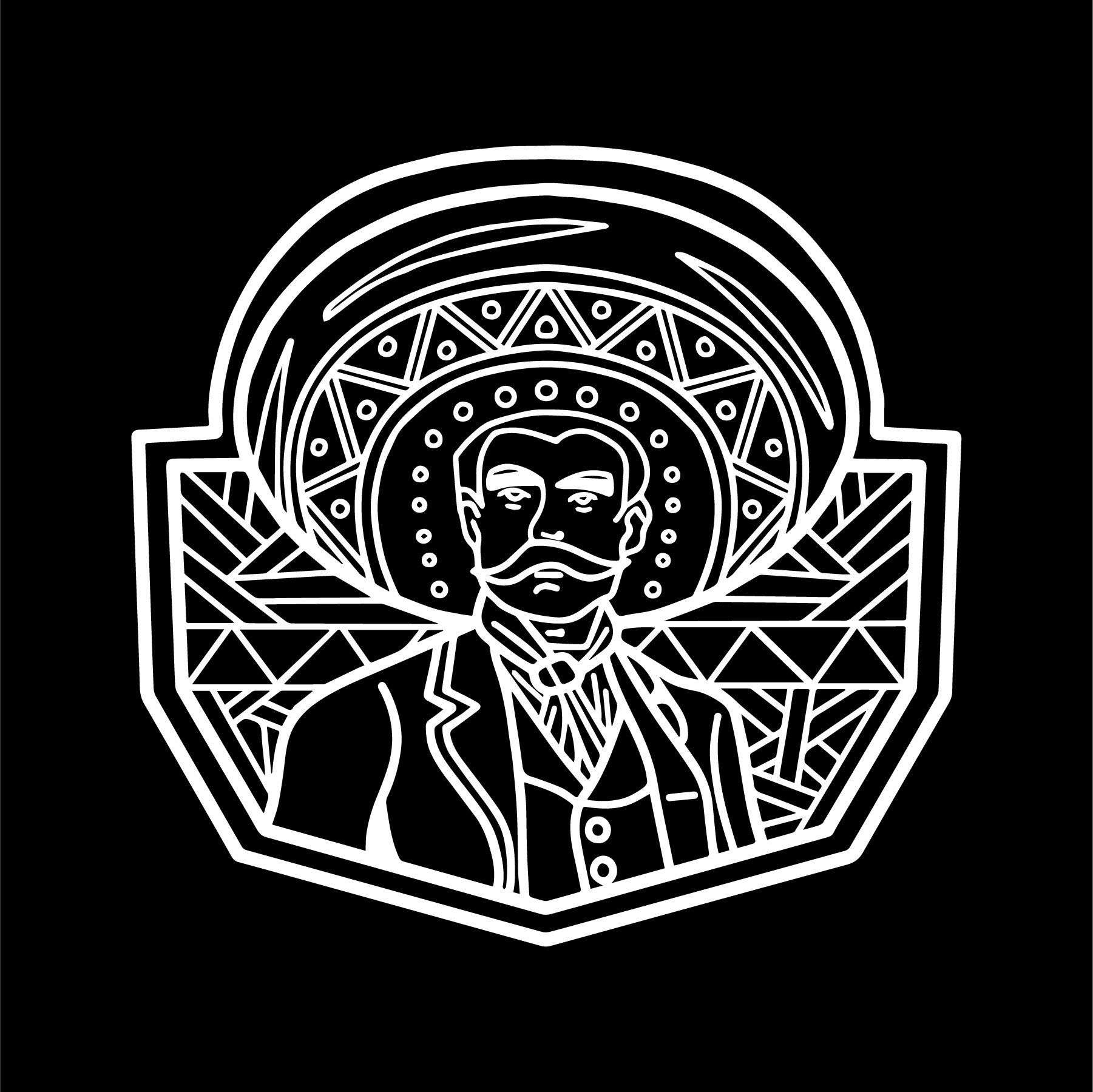
A Tapatio or charro is sort of a cowboy, that’s know all around Mexico and represents the culture if it were to be summed up in one description. Declared by Unesco as a stamp of World Heritage, it’s no wonder any Mexican restaurant would want to promote themselves using this symbol.
IT STARTS WITH A SKETCH, AND THEN MAGIC KICKS IN!


Like I stated before, it all starts with a simple sketch. I like to do all my initial sketches on paper, eventually scan or set everything on Procreate for the Ipad Pro and “ink” it up! Oh! yeah, also adding color to all the illustrations.
A little background on the illustrations: Obviously the “Tapatio” guy, but besides been just his personality I also went with a pattern design symbolic of Mexican culture, and vibrant use of colors.


After creating the final illustrations, it’s time to move everything into Adobe Illustrator and get it ready for its final set up to share for the client, or on my personal website.
Let’s also not forget to make everything ready for Photoshop, and get the different assets for Merchandise ready as well as some mockups for our website so the audience can preview, both digital and physical assets!


