THE FIRST EDITION OF MONSTER MOUTH INSPIRED BY A MARVEL FAVORITE:
CAPTAIN ROGERS!
CREATIVE PROCESS
If your like me, you eat, sleep, and breath a good superhero comic! Even better when the experience reaches the big screen, can’t never wait enough to gain from that experience. But again if you know me, I had to do something else: a more immerse tribute — am a designer; aren’t I?
PHASE ONE: DEVELOP THE PLAN OF ATTACK!
My research was derived to making a tribute that was out of the ordinary (well that as well as watching that thin line within fan art and copyright :) ) That’s when I saw my inspiration - out of nowhere, no surprise, am I right! Scrolling my news feed on Instagram: “The most bizarre collection of weird looking illustrations- really eye catching”. And so… a mood-board began to take shape:
PHASE TWO: LET’S BRAINSTORM THE POSSIBILITIES, AND EXECUTE!
After the initial idea, there was no going back! It fascinated me to start a series of design illustrations that had a temptation of weird. As you can see everything starts on paper, “nothing compares” (like the Weeknd said) to the sound of thick graphite wearing off on that smooth surface — don’t be afraid to get dirty, sketch your ideas out because there is only so much your brain can storage.
After that initial interaction, that’s when my so famed illustrative companion comes into play: My IPad Pro 11 along with old reliable Procreate (at least for this project) served as the pillars to digitalize my paper born inspiration and spark detail, and line work.
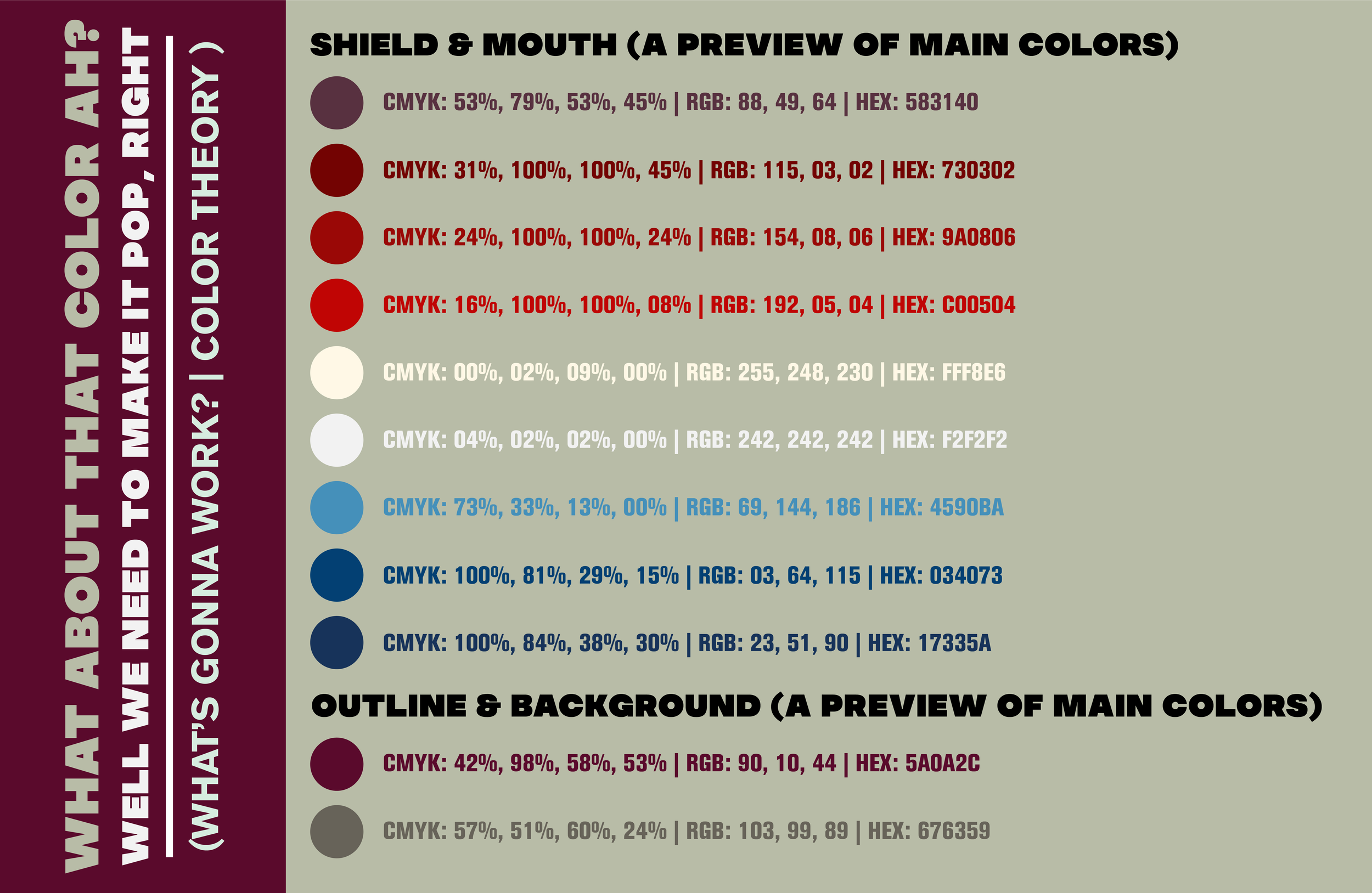
It’s also notable to mention, this is the perfect time to start choosing a color theory, “when you sketch and refine your ideas that’s when you start visualizing different elements such as what color will go here and there, if there is type: which shape would make it more appealing, formal, informal, as well as other things.
PHASE THREE: END RESULT AND REFLECTION ON THE PROCESS
We arrived at the “final stop” of our journey, with the addition of color and refined line work! “Now this is what am talking out!”
The final product looks “rad” doesn’t it? So much that we had to create a mockup of how it would look seating down against a wall, printed in those vibrant colors, I actually can’t wait until the entire series is completed to print all of them and place them side by side (at the moment another 2 poster illustrations.) This phase of the process also allows me to double check simple stuff between the design, some color correction, the bottom isn’t working no more, etc… In the end is a phase that consists of trial by error, but that you can play along with before final production time.
PHASE FOUR: NOT SO FAST BUCKAROO! I SAID REFLECTIONATE — WHAT ELSE CAN WE DO?
Well you guessed it right… last phase was just not enough! There was a lot of brainstorming and moments where I would look at it, & then into space, look at it one more time, and then finally deciding that there was something else there that I could use or create a separate design. That is how the idea of other printed goodies came into fruition:
• Two possible sticker designs.
• Two possible rack cards / postcards.
So far that’s all the separate assets I have cooking but like always Ill keep you updated in case the menu grows :)


